
Plan the whole visit before choosing the artwork
Start with the route a family follows: entrance, check-in, waiting area, hallway, treatment room, checkout, and exit. Each point has a different job. The reception wall may need clear branding, while a long corridor can carry a visual story and a treatment room may benefit from one focused scene.
Mark doors, windows, signs, hand-sanitizer stations, monitors, cabinets, furniture, and equipment on a straight-on wall photograph. This helps the artwork work around the real room instead of competing with it.
1. Give the waiting room one strong story
Choose a theme broad enough to interest different ages: local nature, ocean life, space, travel, animals, music, or an imaginative city. Build the composition around one memorable idea rather than filling every open area with unrelated characters.
A central scene can act as the visual anchor, with smaller details placed where children can discover them while they wait. Leave calmer areas around doors, signage, and seating so the room remains easy to understand.
2. Turn hallways into friendly wayfinding
Long corridors are useful for a sequence. Different wings can use distinct colors, icons, places, or characters that continue from the waiting room. A child might follow a blue ocean route to one area and a green forest route to another.
Murals should support official room numbers, exit signs, and accessibility information—not replace them. Keep required signs clear and use the artwork as an additional visual cue that staff can mention when giving directions.
3. Give treatment rooms individual identities
A set of related themes can make rooms easier to remember without making the office feel visually disconnected. For example, one practice could use a shared “world of discovery” idea, with separate rooms devoted to the sky, ocean, forest, and city.
Place the most interesting details where patients are likely to look from a chair or exam table. Review the design from those viewpoints before approval; a feature that looks perfect while standing may be hidden by equipment or too high to see from the patient position.
4. Design at more than one viewing height
Children, teenagers, caregivers, and staff experience the same wall at different heights. Put some small discoveries lower on the wall, keep the main scene readable at adult eye level, and avoid placing every important element near the floor.
Use scale deliberately. One oversized animal, tree, rocket, or wave can feel more immersive than many tiny illustrations. Before production, place child-height and adult-height figures on the digital mockup to check proportions.
5. Match the energy to the room
Not every area needs the same intensity. A lively reception wall can create a memorable welcome, while transition areas may call for more open space, a simpler palette, and slower visual movement. Staff spaces can use a more sophisticated interpretation of the practice’s colors or mission.
Think about what is already in the room. Bright toys, displays, furniture, and notices add visual activity. A mural can balance those elements instead of adding another layer of competition.
6. Create an optional photo or milestone wall
A designated photo area can celebrate first visits, completed treatment, birthdays, or other practice-specific moments. Keep the standing zone clear, place the practice name where it will remain visible beside or above a person, and leave enough distance for a phone camera.
Use permanent artwork for the background and consider changeable graphics for dates, seasonal messages, or milestones. Our guide to designing a photo-ready feature wall covers framing, lighting, branding, and traffic flow in more detail.
7. Choose artwork that can grow with the practice
Before choosing a strongly age-specific style, consider the full patient range and the brand the practice wants to build. A layered illustration can feel playful to young children while still looking polished to older patients and caregivers.
Keep permanent architectural features, frequently changing promotions, and seasonal content separate. A lasting mural can carry the main environment, while smaller replaceable elements handle short-term messages.
Direct-to-wall printing or vinyl graphics?
Direct-to-wall printing can be a strong option for custom artwork intended to become part of the room. Vinyl graphics can be useful for information or elements expected to change. Some offices may benefit from a combination: a permanent printed scene with replaceable names, milestone messages, or seasonal details.
See our practical comparison of direct-to-wall printing and vinyl wall graphics when deciding how long each part of the design should remain in place.
Prepare the wall and the artwork together
Good planning includes the wall’s condition, finish, measurements, access, and nearby obstructions. Photograph the surface straight on and from both corners, and record the location of every outlet, fixture, cabinet, rail, and sign. Our wall-printing preparation checklist explains what to gather before design begins.
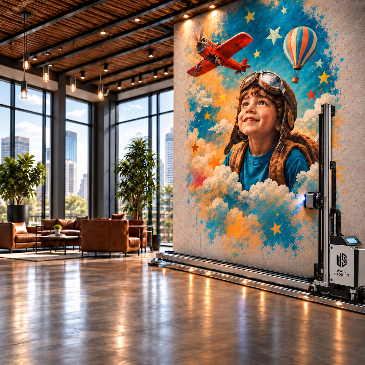
Wall Stories Creative plans artwork to feather or fade before the ceiling, floor, left edge, and right edge. Keep faces, lettering, logos, and other essential details comfortably inside those boundaries so they remain complete and readable.
A simple brief for your mural designer
Include the room’s purpose, patient age range, practice colors, ideas to include or avoid, the desired feeling, exact wall measurements, photographs, fixtures, furniture, and any areas that must remain visually quiet. Note where people usually stand, sit, and look.
For a multi-room project, identify what should stay consistent across the practice and what can change from room to room. That decision creates variety without losing a unified visual identity.
Planning a pediatric office mural?
Send Wall Stories Creative a photograph of the wall, approximate dimensions, and the experience you want families to have. We’ll help you shape the theme, placement, printable boundaries, and production approach.
Request a consultation