
Start with the job the wall needs to do
Before choosing artwork, decide what should change when someone sees the wall. Should it introduce the brand, help people navigate, explain the company’s story, energize a work area, or make a meeting room more memorable? One clear purpose usually creates a stronger result than trying to fit every message into one design.
Photograph the wall from straight on and from the path people use to approach it. The most important view is not always the widest one. Furniture, glass, doorways, monitors, and natural sight lines should influence the artwork’s scale and placement.
1. Create a recognizable conference-room backdrop
A conference-room wall often appears behind employees during video calls and presentations. A restrained brand pattern, architectural linework, or logo placed away from heads and screens can give the room identity without becoming a visual distraction.
Keep small text out of the design. It can be difficult to read on camera and may appear backward in mirrored video previews. A bold shape, color field, or simple mark generally works harder from across the room.
2. Turn a corridor into a company story
Long hallways provide space for a visual narrative: company milestones, local history, products, maps, photographs, or an abstract progression using brand colors. The artwork can unfold as someone walks instead of asking them to stop and read a dense timeline.
Choose one visual rhythm and repeat it. Consistent spacing, image treatment, and color make separate moments feel like one designed experience.
3. Build a culture wall employees will actually notice
A list of corporate values can disappear into the background. Translate those ideas into specific language, real imagery, or a graphic system that reflects how the team works. A manufacturer might feature the tools and details behind its craft; a creative company might show sketches, process marks, or local influences.
If the message changes frequently, combine a lasting printed background with replaceable vinyl lettering or mounted elements. Our guide to direct-to-wall printing versus vinyl wall graphics explains when each method may fit.
4. Use wall graphics to support wayfinding
Color, oversized numbers, department names, and destination graphics can make an office easier to understand. Wayfinding should be direct: use strong contrast, short wording, and placement that remains visible when doors are open or people are moving through the space.
A mural can reinforce the system without replacing necessary signs. For example, each floor or department might have its own color and graphic motif while room identification stays simple and consistent.
5. Give collaboration areas a visual anchor
Open collaboration areas can feel like leftover space unless something defines them. A large abstract composition, illustrated map, or brand-inspired pattern can create a visual center and distinguish the area from nearby workstations.
Plan around whiteboards, displays, acoustic panels, and furniture. Important faces, words, or logos should not disappear behind a monitor or chair. Treat those fixed objects as part of the composition from the beginning.
6. Make client meeting areas feel specific to the business
A client-facing room can communicate expertise without repeating the lobby logo. Consider a close-up product detail, an industry-inspired illustration, a map of the area served, or a visual interpretation of the outcome clients come to the company to achieve.
For professional services, the tone might be quiet and precise. For hospitality, entertainment, or creative work, the same wall can carry more movement and color. The room’s purpose should guide the personality of the artwork.
7. Add character to break rooms and wellness spaces
Employee spaces do not need to look like the public side of the office. Break rooms can support brighter color, humor, local references, or nature-inspired artwork. A quiet room may call for a softer composition with generous open space and fewer visual details.
These walls are also good places to separate internal culture from customer-facing messaging. The design can speak directly to the people who use the office every day.
Choose the right amount of branding
Not every wall needs a logo. A recognizable palette, shape language, photography style, or subject can connect a space to the brand more subtly. Reserve the strongest logo treatment for a location where identification matters, then let supporting walls expand the story.
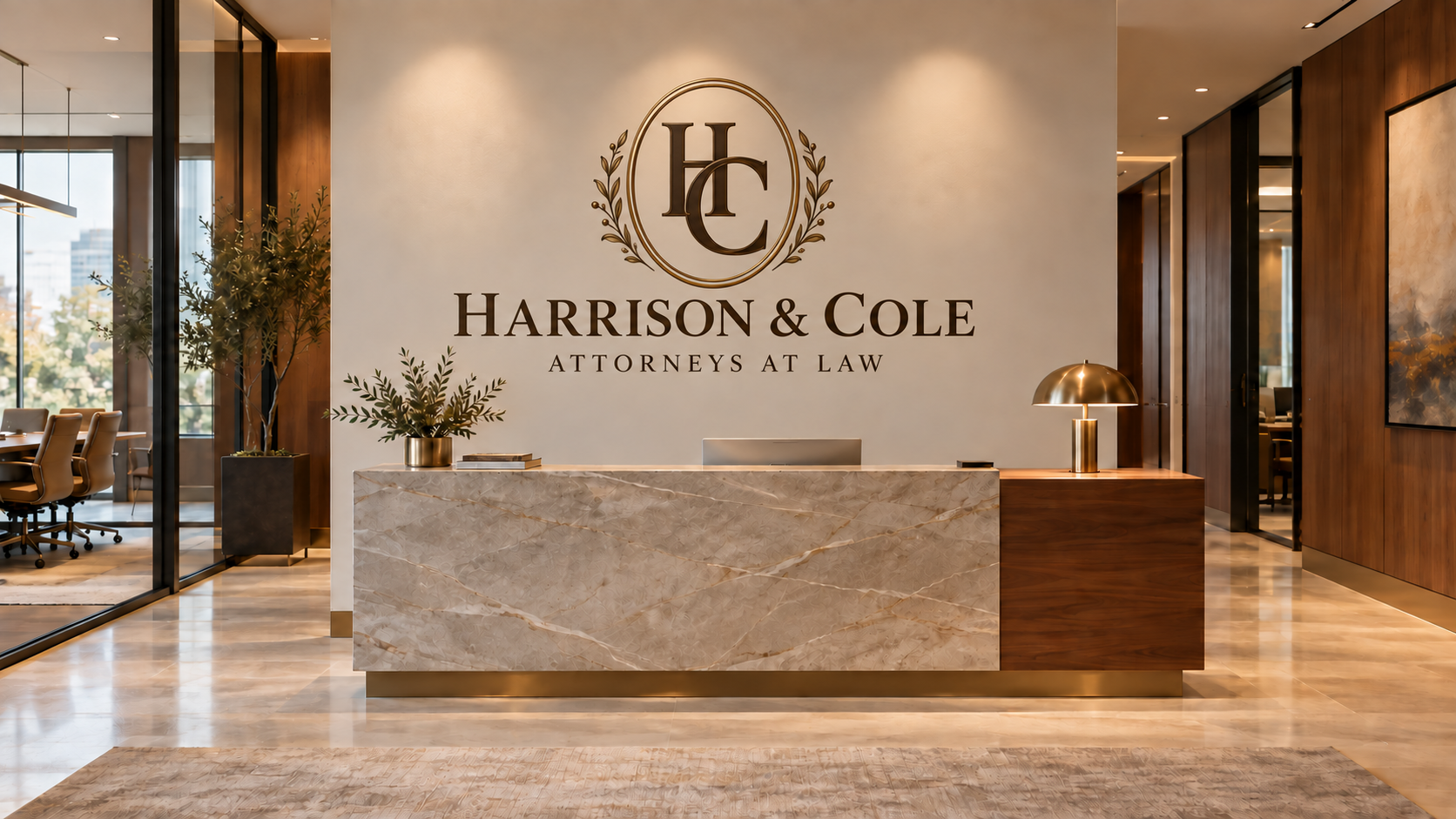
For a reception-specific approach, see our guide to creating a memorable office reception wall. The same planning principles can apply to many professional spaces.
Plan artwork inside the printable area
Wall Stories Creative designs direct-printed artwork to feather or fade before the ceiling, floor, left edge, and right edge. Keep faces, logos, and important words comfortably inside those boundaries. A composition with breathing room usually looks more intentional and adapts more gracefully to the real wall.
Before the design stage, gather the wall’s width and height, clear photographs, paint and surface details, fixture locations, nearby furniture measurements, and the primary viewing direction. Use our wall-printing preparation checklist to organize the information.
Build an office graphic system, not a collection of unrelated walls
If several areas are being considered, start with one visual system that can change in intensity. The reception wall may carry the boldest brand statement, while conference rooms use related patterns and corridors carry the narrative. Repeated colors, typography, and image treatments make the office feel connected without making every wall identical.
Which office wall should you start with?
Send Wall Stories Creative a few photographs, approximate dimensions, and the goal for the space. We’ll help you identify the strongest wall and discuss artwork, direct-to-wall printing, decals, and practical next steps.
Request a consultation